Blue Campaign

See more, including animations, here.
Delivery_
Graphic Design
Production Design
Animation and Motion Design
Social Media Campaigns
Years_
2022 – 2024
About_
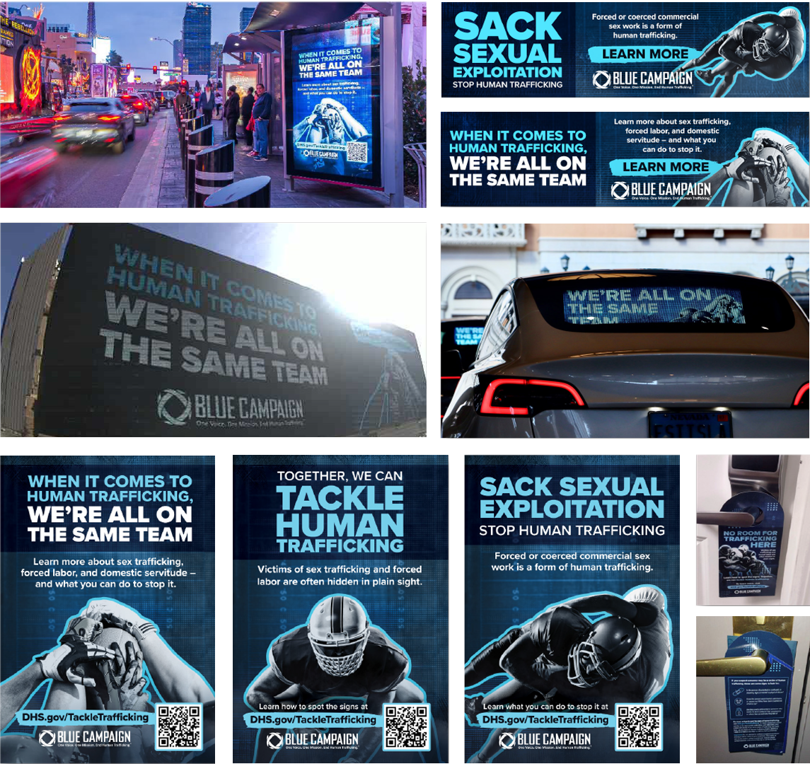
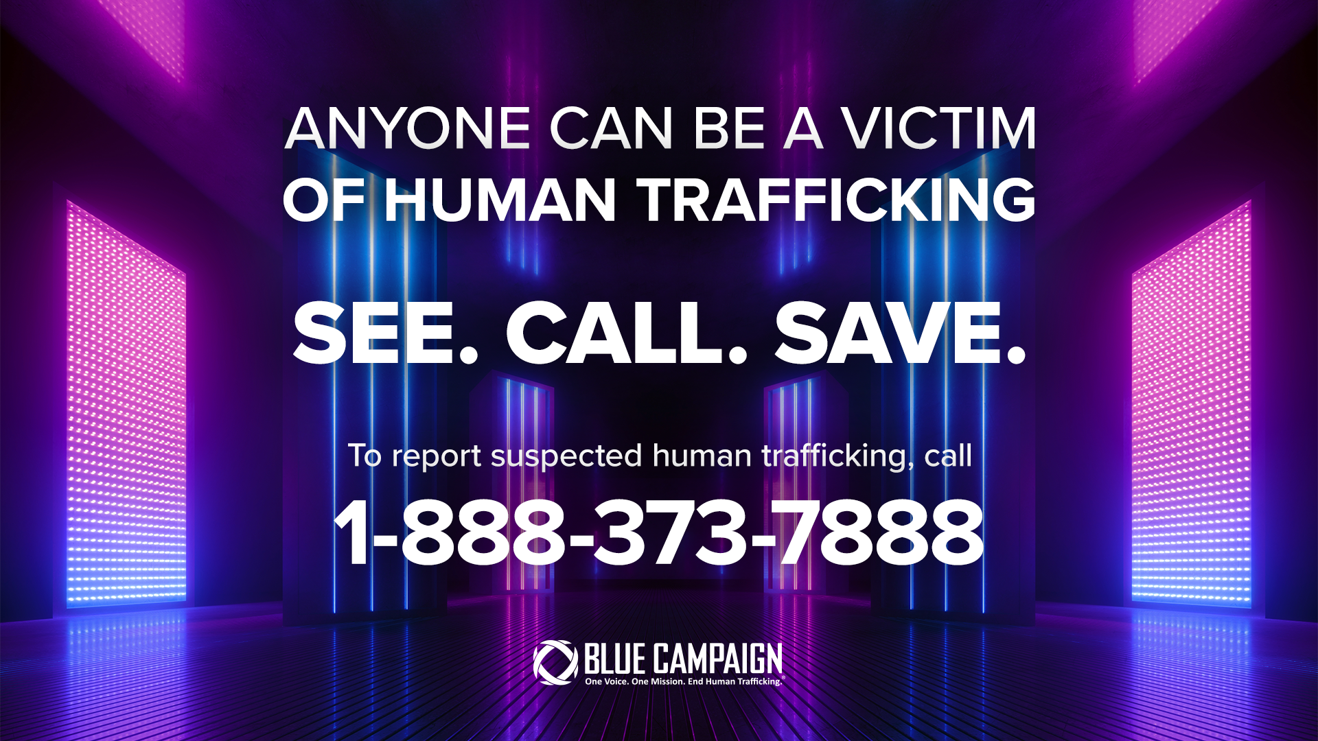
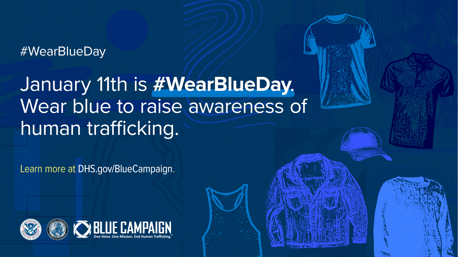
Blue Campaign is a national public awareness campaign designed to educate the public, law enforcement, and other industry partners to recognize the indicators of human trafficking, and how to appropriately respond to possible cases.
Design_
Working with Blue Campaign, I was able to flex a lot of my creative skills. They wanted eye-catching, modern designs that would help in capturing the audience’s attention, and an increased production of animated posts for social media. We also had many local campaigns to raise awareness against human trafficking. One of which was a massive campaign for the Super Bowl in 2024. I led the design team to creating all assets and animations, and not only was the client ecstatic, but it led to winning gold at the dotCOMM awards.
See Something, Say Something
See more, including animations, here.
Delivery_
Graphic Design
Product Design
Visual Identity
Rebranding design
Year_
2022-2024
About_
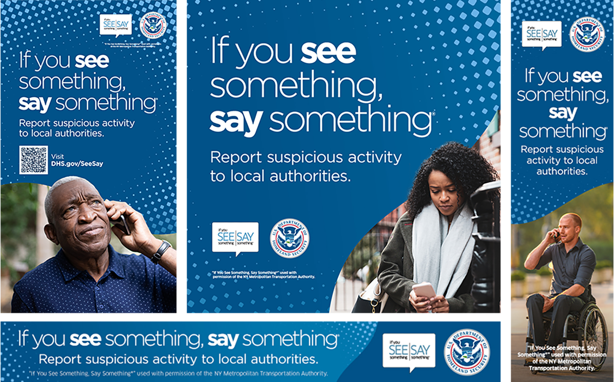
“If You See Something, Say Something®” is a national campaign that raises public awareness of the signs of terrorism and terrorism-related crime, and how to report suspicious activity to state and local law enforcement.
Design_
A well established brand under the Department of Homeland Security, my design team was tasked to provide different layout options for production designs. We would also create new designs for campaigns, both online and in person campaigns. Our team would regularly design event materials for the organization when they would table at events.
The designs wanted to focus on being approachable and encourage folks to speak up rather than ignore anything suspicious. Oftentimes, how terrorism can go unreported is that bystanders don’t feel the need to report smaller, seemingly suspicious activity, since reporting something small to authorities can be intimidating. But the campaign emphasizes that it’s better to be safe than sorry and report anything that they see to keep their community safe.
Premium Beat

See full boards here.
Delivery_
Motion Design
Visual Identity
Year_
2021
About_
PremiumBeat is a Shutterstock company, and provides exclusive, high-quality tracks and sound effects for use in new and traditional media projects, including videos, films, apps, games, and television programming.
Design_
These boards were a pitch to the brand to have a short branding ad. I wanted to incorporate the brand’s warm gold coloring to not only create an inviting feeling, but to also unify the ad visually. The full boards play with the sound bar motifs that the logo builds on to also unite the ad under the brand. The full boards are here.
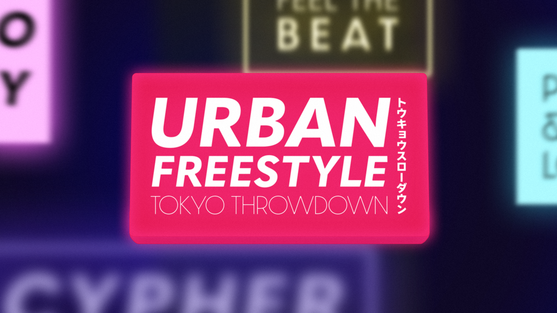
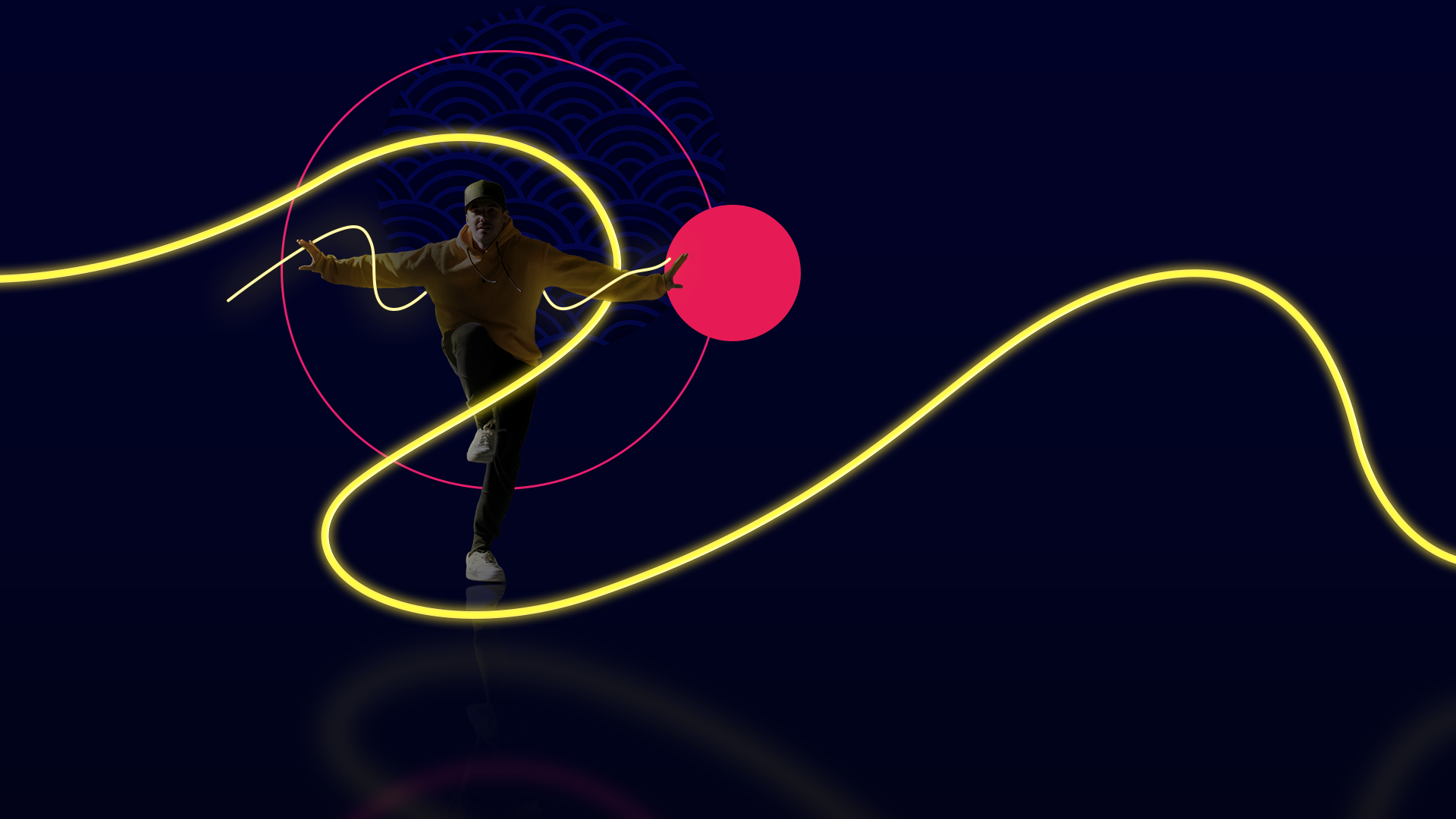
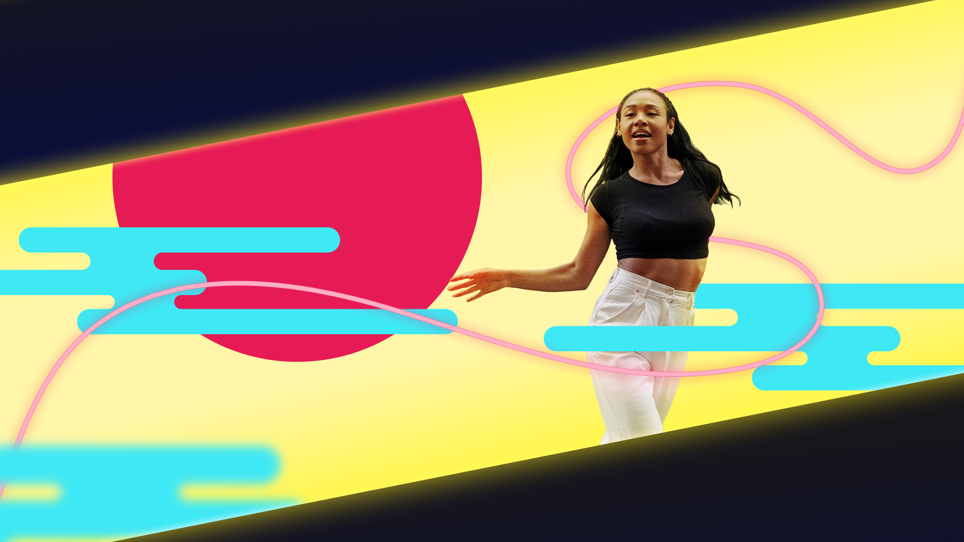
Urban Freestyle: Tokyo Showdown
See full boards here.
Delivery_
Motion Design
Art Direction
Visual Identity
Year_
2021
About_
Urban Freestyle: Tokyo Throwdown is a fictional dance competition airing on Fox. I, as the art director and motion designer, was tasked to create boards for an intro sequence, showcasing the Roboto Crew.
Design_
As someone who appreciates freestyle dancing, I wanted the design to emphasize the free flow nature of the show. I imagined each crew would have dancers that dance in different styles, like hip-hop, locking, b-boying, and so on. I used the neon line element as a through-line to lead the viewer to showcase each dancer, while also having it be very flexible and bendy to again highlight the freestyle element, and to create visual interest.
Check out my full boards here!
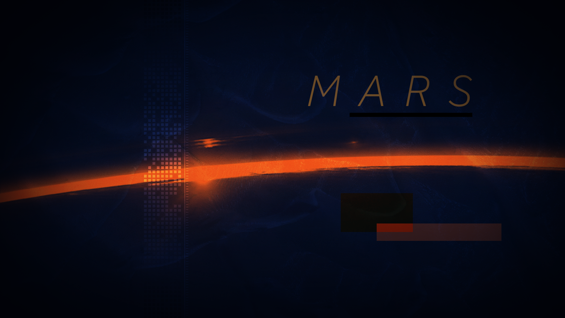
Expedition 100

See all styles here.
Delivery_
Motion Design
Art Direction
Visual Identity
Year_
2021
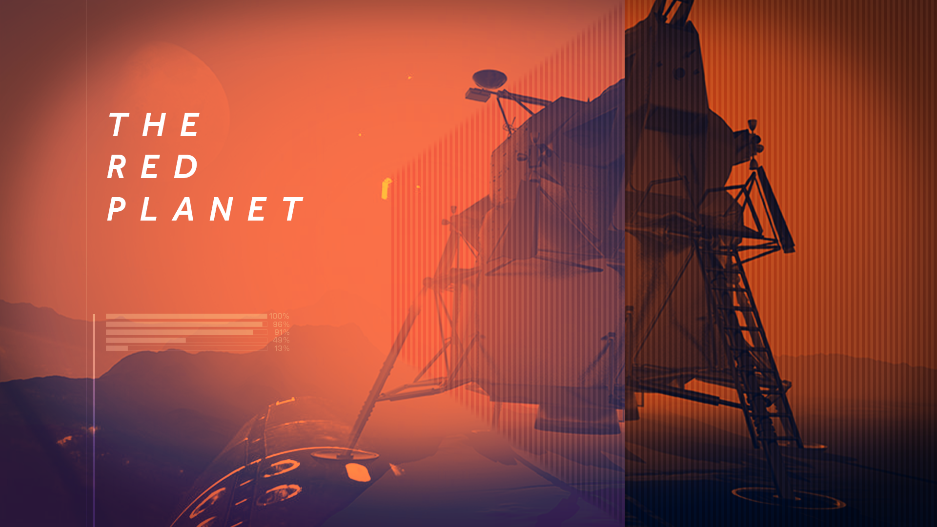
About_
Expedition 100: Mission to Mars is a fictional show from NASA featuring all the components of a mission to the planet Mars. The brief mentioned wanting to have a sense of mystery and suspense for the show as well.
Design_
Space was, and still is, a fascination of mine, so I was excited to take on this project. I used various color combinations and played with extra visual elements to really immerse the viewer in the astronauts’ experience. Each color combination sets a different tone; for example, the color combination here uses a warm, bright orange to hint at Mars, while the cooler, deep blue nods at the void of space, and gives a slight eerie undertone as well.
Check out the two other styles and color combinations here!
IBM
See the full boards here.
Delivery_
Motion Design
Art Direction
Visual Identity
Year_
2021
About_
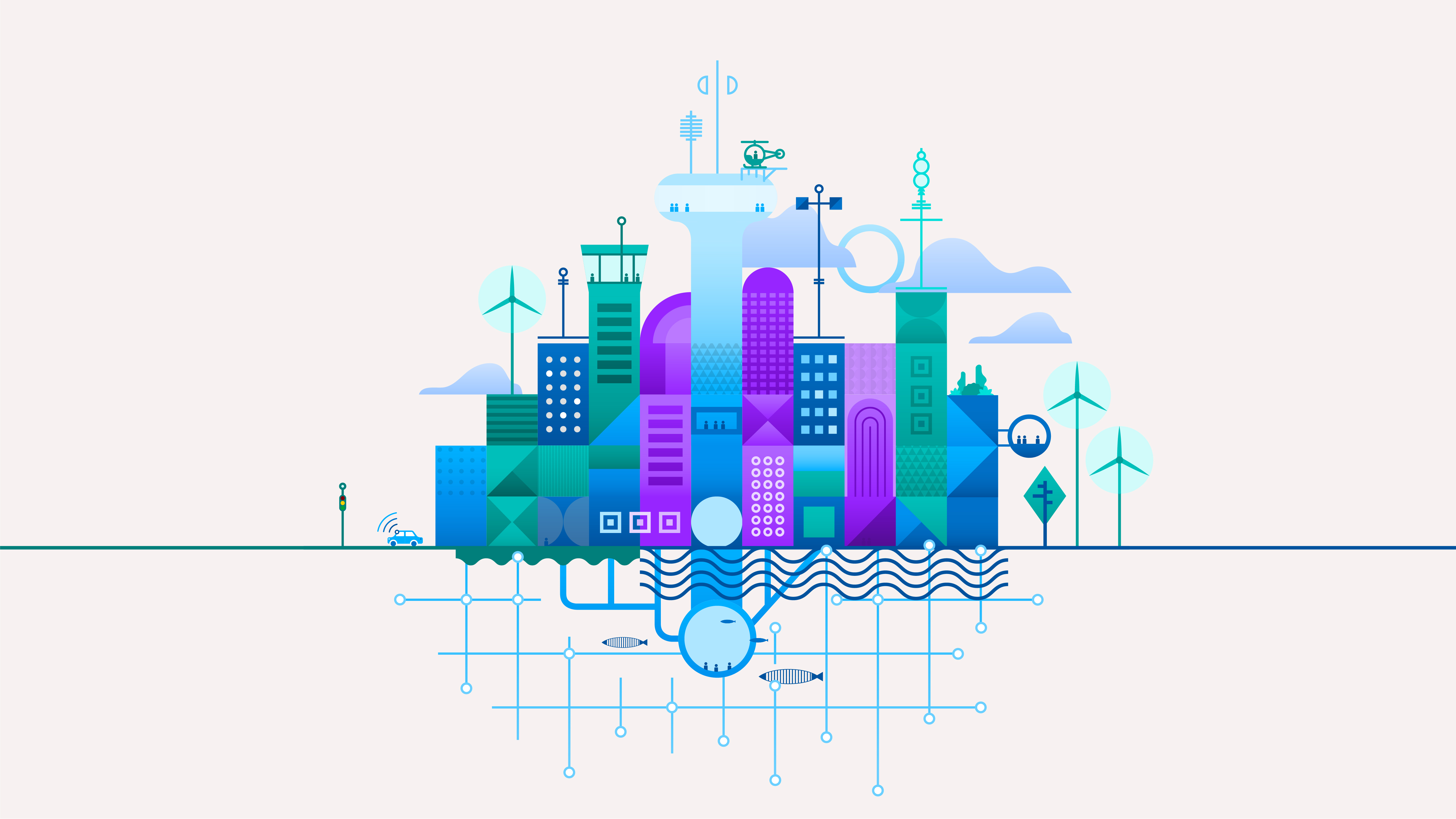
IBM is one of the world’s largest industrial research organization in the world. The mission of IBM is to be a catalyst that makes the world work better. We aim to have a positive impact globally, and in the communities where we operate, through business ethics, environmental commitment and responsible technology.
Design_
This project for IBM was to create an animated video featuring IBM’s SmartCity. A SmartCity is an urban area where technology and data collection help improve quality of life as well as the sustainability and efficiency of city operations. Smart city technologies used by local governments include information and communication technologies and the Internet of Things. I wanted to use clean designs and cool colors to create a sense of an organized and futuristic city, and to emphasize IBM’s visual branding and creating technology for the future.
Check out the full boards here!
Diesel


See the mood board and the full boards here.
Delivery_
Motion Design
Art Direction
Visual Identity
Year_
2021
About_
Diesel is an innovative Italian lifestyle brand, that started with a focus on premium denim and apparel and has expanded into accessories, fragrances, eyewear, and more. The brand is known for its bold, modern, and rebellious aesthetic, blending its denim heritage with contemporary designs and often leveraging provocative, humorous, and satirical advertising campaigns.
Design_
This project featured a fictional EDM festival that the brand Diesel wanted to host in Spain. The brief required a moodboard and motion boards for a branded ad to showcase some top DJs, as well as the details of the festival. Going off of Diesel’s rebellious and provocative style, I chose a more edgy feel and a simple color palette to have the ad be perceived as part of the brand. The mood board features some of my inspiration for the motion boards.
Check out both boards here!
12KM
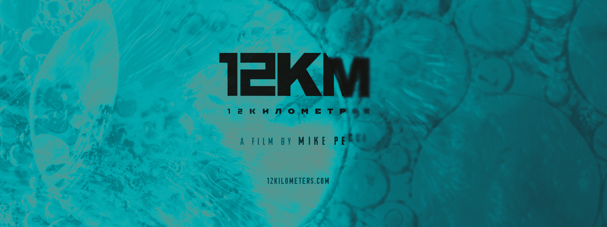
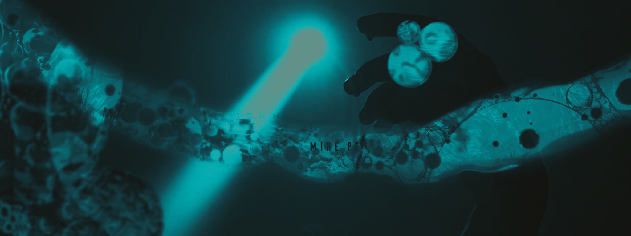
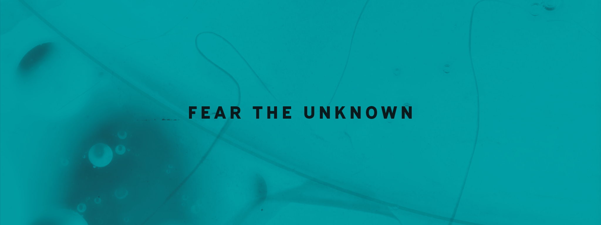
See the full boards in both styles here.
Delivery_
Motion Design
Art Direction
Visual Identity
Year_
2021
About_
12 Kilometers is a science horror film directed by Mike Pecci. Set against a backdrop of 1980s Russia, a team of scientists and their drill crew have dug the deepest hole known to man. It was recently accepted into the Boston International Film Festival, which requires a theatrical trailer for the film.
Design_
This fictional project featured a blend of designing the opening title card and end card, along with weaving in some graphic effects to intrigue the viewer. The trailer hints at a mysterious substance at the bottom of the hole, so I wanted to reflect that in the textures I used for the boards. I featured graphic elements drawn from parasites, petri dishes, and liquid suspension. For this project, I pitched two different color palettes. Having recently watched Midsommar, I was inspired by the film’s bright color palette, and wanted to try my hand at using a brighter color palette to create a suspenseful effect.
Check out both boards here!
Converse
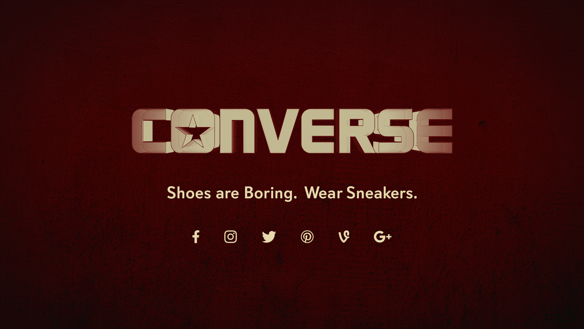
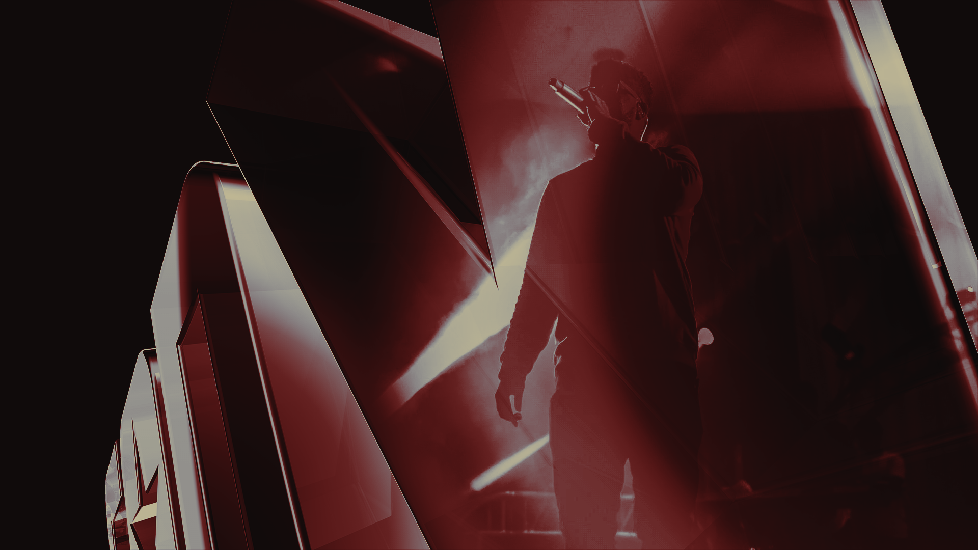
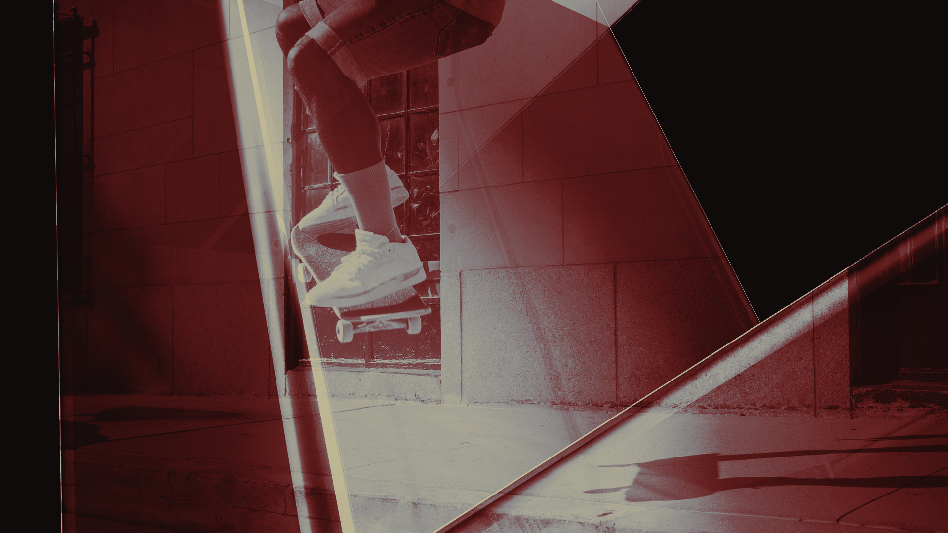
See the full boards here.
Delivery_
Motion Design
Art Direction
Year_
2021
About_
Converse is an American lifestyle brand that markets, distributes, and licenses footwear, apparel, and accessories. The brand is fueled by revolutionaries, self expression, and defying conformity.
Design_
This project featured a :05 logo reveal animation to use on the end of videos the brand publishes online, such as on social media, YouTube, and possibly at the end of pre-roll ads. I wanted to dabble in using 3D software, so I blended photography with 3D mockups of the logo to create a dynamic set of boards.
Check out the boards here!
Cactus Juice Zine
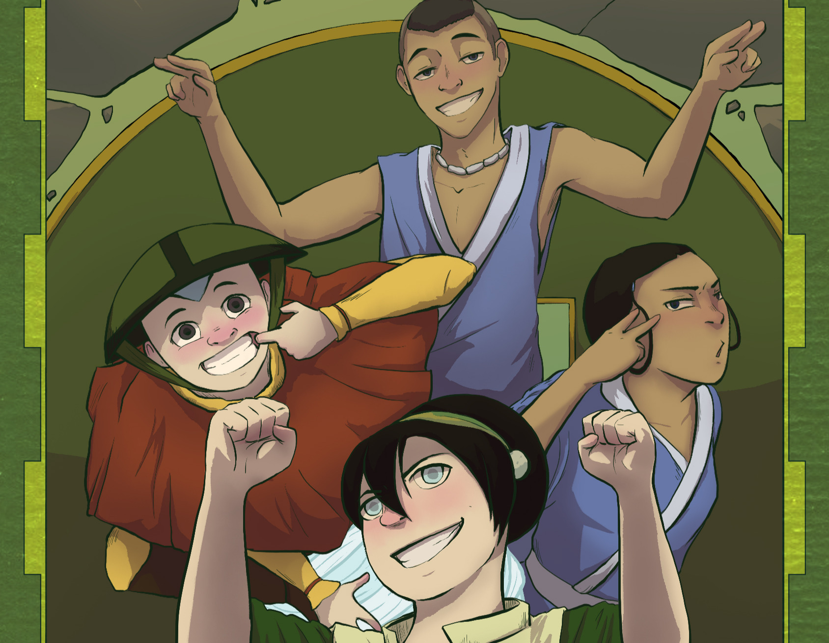
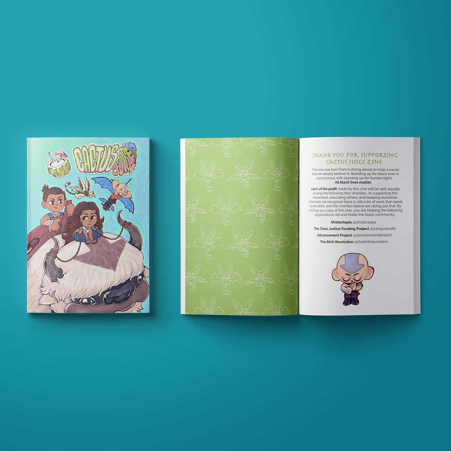
See more here.
Delivery_
Illustration
Art Direction
Year_
2020
About_
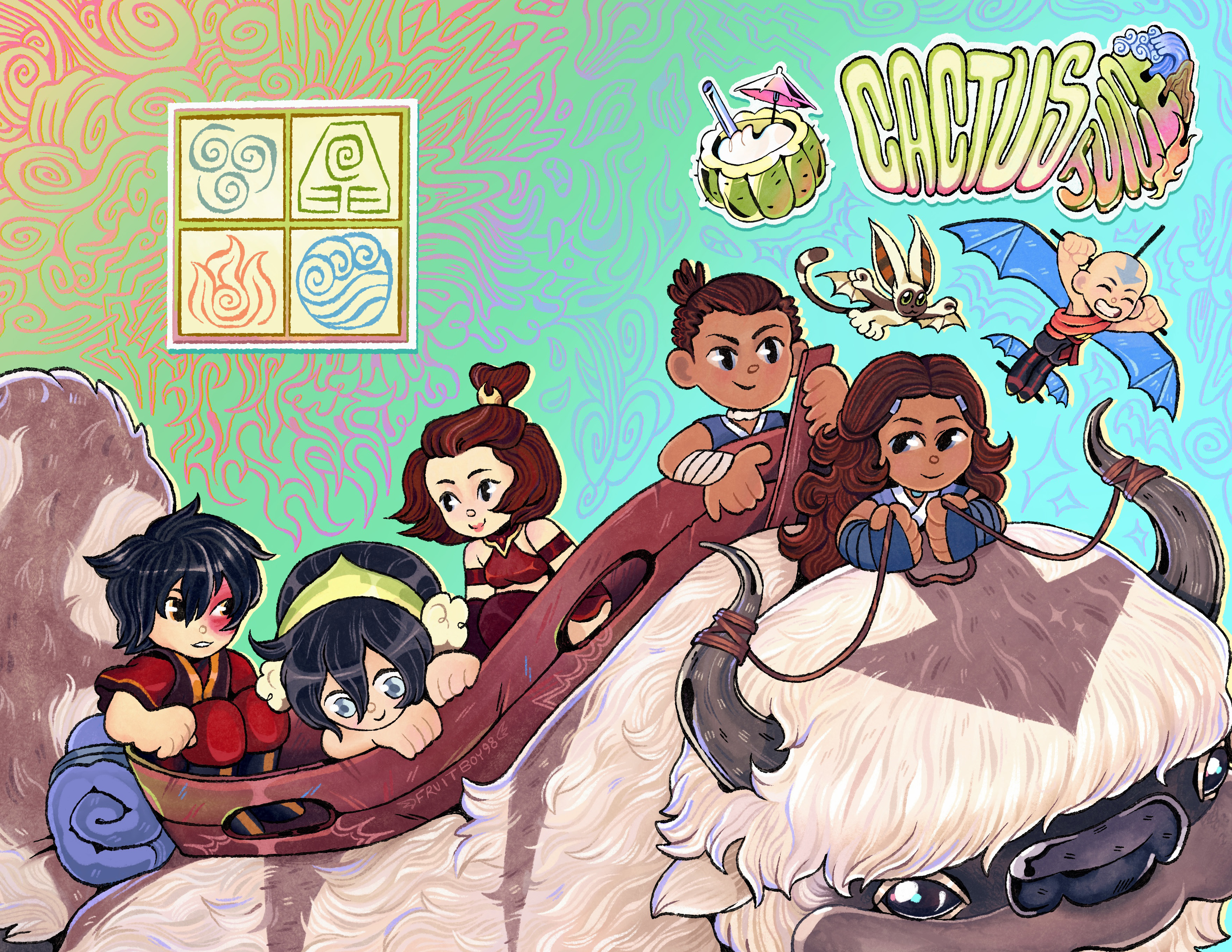
This zine was born from a strong desire to help a cause that I and the zine organizers deeply believe in. Standing up for black lives is synonymous with standing up for human rights. All black lives matter. 100% of the profit made by this zine will be split equally among the following four charities. In supporting this movement, educating others, and keeping ourselves informed, we recognize there is still a lot of work that needs to be done, and the supported charities are doing just that. This project was a huge collaboration of over 100 artists over just two months.
Design_
For this project, I made an original illustration based off of an episode from the series Avatar: The Last Airbender. The group was born from artists who loved the series and wanted to give back to charities during the start of the BLM movement. I chose the episode “The Blind Bandit”, and referenced the levity of the humor and the momentous introduction of Toph.
Check out the full illustration here!
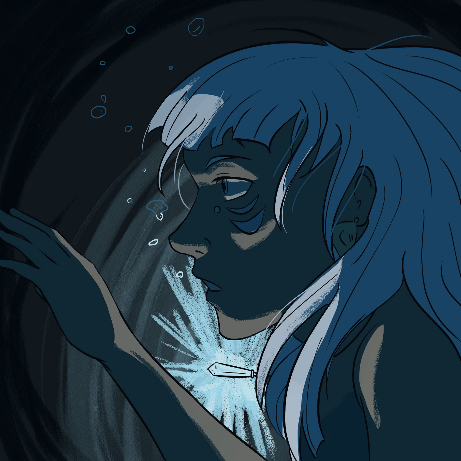
Illustrations


See more here.
Delivery_
Illustrations
Year_
2020 – Present
About_
I’ve been painting and illustrating since a very young age, and I feel fortunate enough to have translated those skills onto a digital platform! These are some of my illustrations I have done for online projects, or just in my free time.
Check out more here!
AidData


See my array of work here.
Delivery_
Layout Design
Cover Design
Graphic Design
Animation
Video Production
Typography
Website Design
Branding
Year_
2018-2022
About_
Housed at William & Mary, AidData is a leading international development research lab. They connect decision-makers and researchers who have a shared interest in working together using granular data and innovative tools to solve pressing problems, precisely target resources, and use rigorous evidence to measure the impacts—intended and unintended—of policies and investments.
AidData prioritizes working in areas where their expertise can have an outsized impact: data-poor environments where there is an unmet need for better evidence and insights.
Design_
My time with AidData actually began when I was a student at William & Mary. I worked as an in-house designer for their communications team, designing cover art for all of their reports, laying out their reports for print, and creating data visualizations to supplement any report content. I soon began to help produce videos, and it was through that avenue I discovered my passion for motion and animation. This interest led me to self produce, direct, animate, and edit a three part video series accompanying a large report launch, explaining the specific research points into layman’s terms so almost anyone could understand them.
Check out those videos and more here!
Twitch
See my work here.
Delivery_
Logo Deisgn
Graphic Design
Animation
Branding
Year_
2019
About_
Remoonla is an up and coming streamer on Twitch. She focuses on gaming content, but also dabbles in other hobbies, such as cooking and crafts.
Design_
A twitch streamer, Remoonla, wanted to create some branding for her channel for cohesion and to provide a sense of her interests. She noted that she wanted a cat, a music element, and the moon to be featured in her logo. She also gave me a color palette to work with. I incorporated the elements in a logo sketch, and we collaborated on building up the design to what it is now. I also made custom animated screens for her streams when she is about to start, needs to step away from the stream for a brief moment, and when she is offline. The cat featured in all three animations is inspired by her own cat, along with a cup of tea.
Check out those videos and more here!
Presentations
See my work here.
Delivery_
Branding
Presentation Design
Template Design
Year_
2024
About_
The Veterans Affairs (VA) is an executive branch department of the federal government charged with providing lifelong healthcare services to eligible military veterans at the 170 VA medical centers and outpatient clinics located throughout the country. Non-healthcare benefits include disability compensation, vocational rehabilitation, education assistance, home loans, and life insurance.
The VA Office of Nursing Services (ONS) is a dynamic, diverse group of honored, respected, and compassionate professionals. VA is the leader in the creation of an organizational culture where excellence in nursing is valued as essential for quality healthcare for those who served America.
Design_
My client wanted custom presentation designs for the ONS team that reflected the professional, modern, and communicative design that gave out crucial information for the nursing team nationwide.
Please note this page is password protected. Please reach out for more information.
