evolving a historic brand to be future forward
The Washington Metropolitan Area Transit Authority, commonly referred to as WMATA or the Metro, underwent a giant rebranding that established a polished brand style and harmonized all things WMATA related under one brand. As part of the rebrand, I was brought on board as a design consultant to offer my expertise to a newly established department under WMATA.
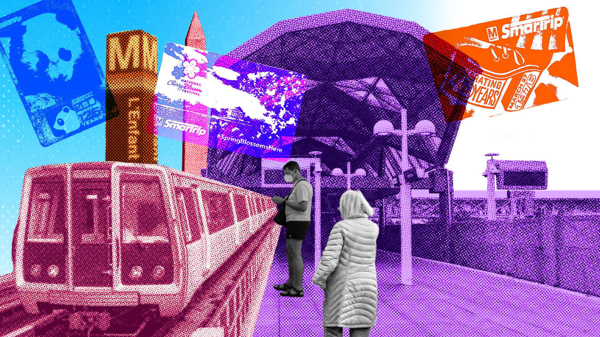
Dashboard Design
This design was inspired by the 2025 Metro Rewind. I drew inspiration also from collages and risograph printing and created the background and inspiration image for a dashboard series within the department.
– Head Designer
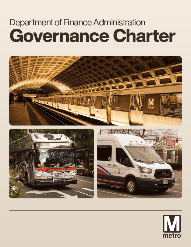
Governance Charter
The department wanted a branded charter that would outline the specific roles and responsibilities of the new department. I was tasked to design and format the charter from cover to visual content.
– Head Designer


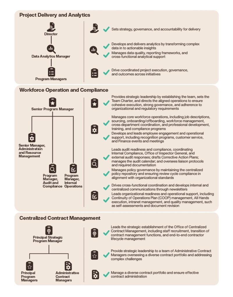
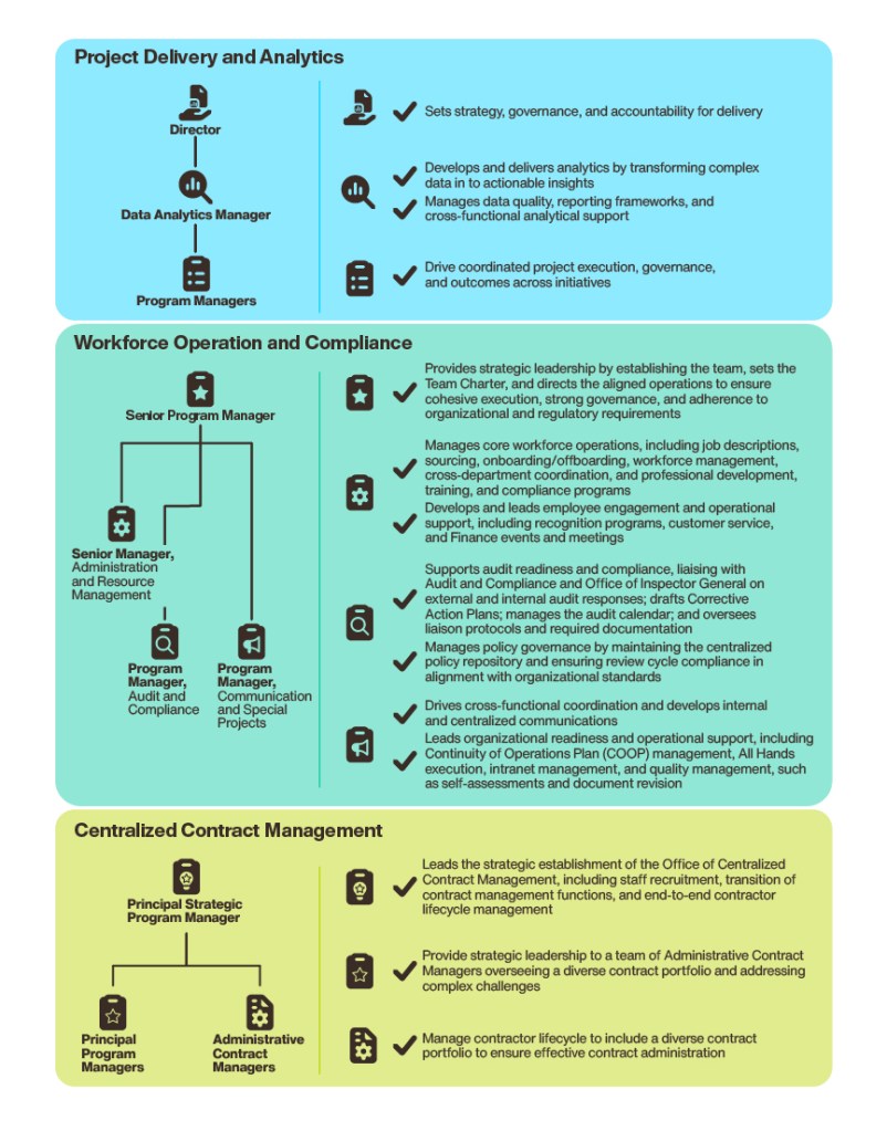
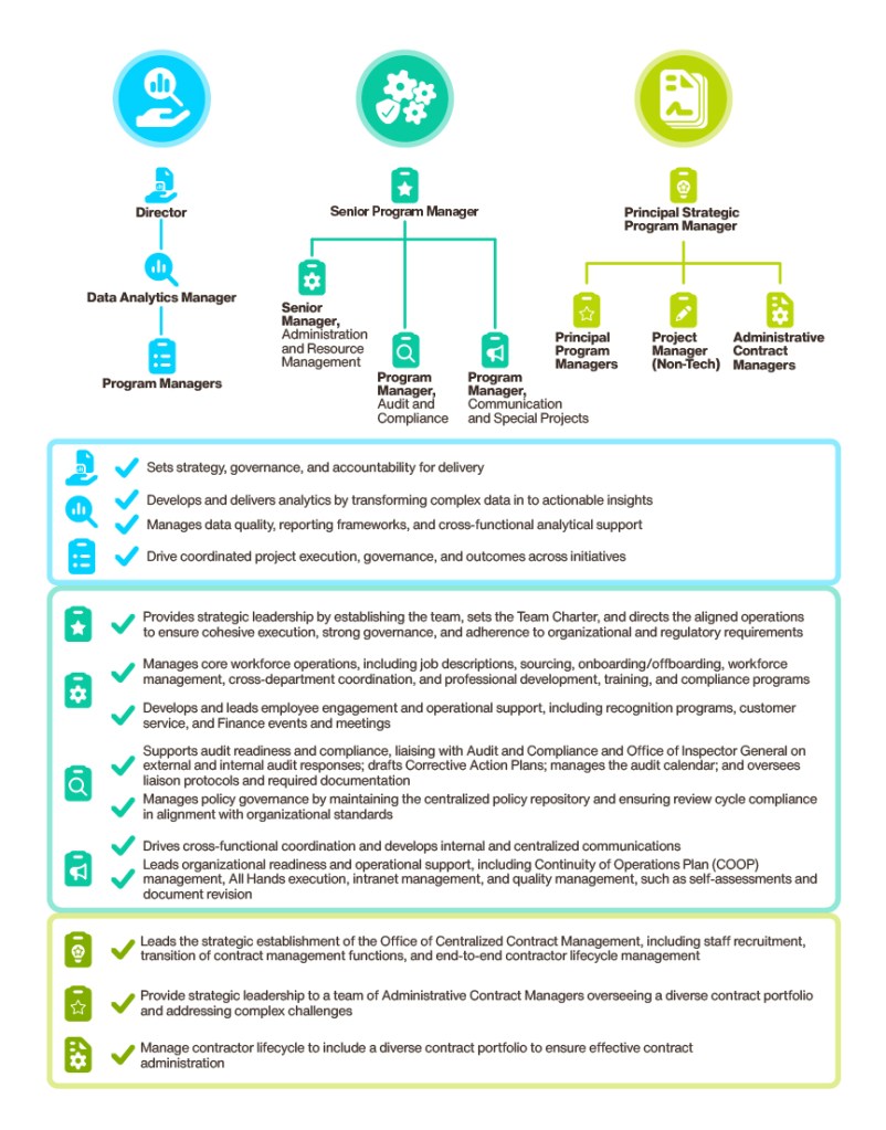
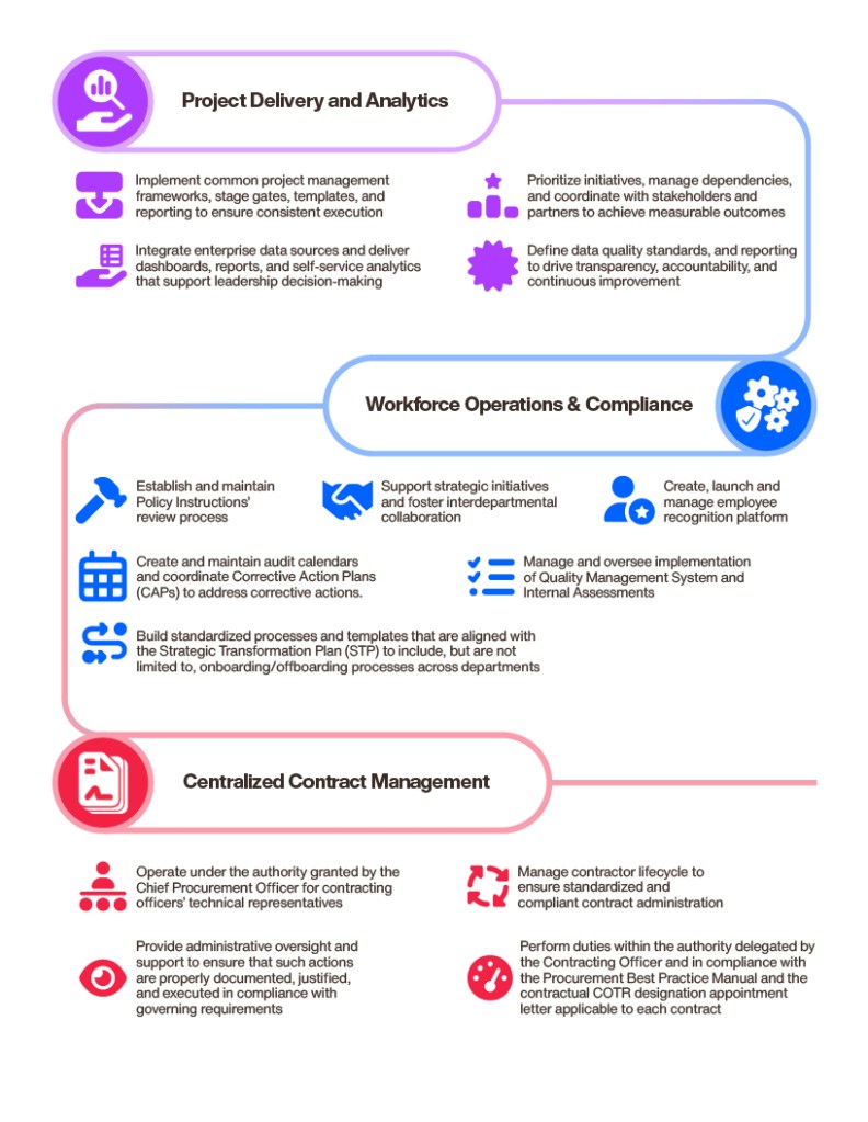
Infographic Design
Within the report, the clients wanted to have tables and sections of information organized visually. I iterated four different designs that kept the readers engaged. Using the brand guidelines, I approached the idea in different forms, providing options for the client to choose.
– Head Designer
Powerpoint/Presentation Design
I designed slide decks for internal presentations, creating custom icons, graphs, and images to visually supplement the information.
– Designer
